Haskell logos/New logo ideas: Difference between revisions
No edit summary |
PaulJohnson (talk | contribs) (Added Oroboros) |
||
| Line 637: | Line 637: | ||
http://www.haskells.com/images/logo.gif | http://www.haskells.com/images/logo.gif | ||
--- | |||
[[Image:Ouroborous-oval.png|Ouroboros oval]] | |||
Someone on the mailing list suggested something based on [http://www.example.com Orouboros]. Here is the [[Ouroborous-oval.svg Inkscape SVG]]. | |||
[[User:PaulJohnson|PaulJohnson]] | |||
Revision as of 12:00, 21 December 2008
The great 2009 Haskell logo contest
The Haskell logo has changed over time, and the current "new" logo reflects the advanced features of Haskell. However, it is looking rather dated, and doesn't necessarily reflect the mature Haskell we have now.
So, time to find a new logo. Something reflecting the modern emphasis of Haskell on purity and simplicity.
Please submit logo-sized (not overly large) versions of your logo with optional text, with a preferably white background (such as for use on haskell.org).
Please submit your entries here, and attach your name to them please. To be eligible, they will need to be visible on this page (e.g. uploaded, or link to the image). The image should be freely available (a suitable freely distributable license). Entries not displayed here won't be eligible.
The deadline for submissions is December 31, 2008, after which the top few submissions will be voted on by the community to decide a winner!


Strange Lambdanimal, with or without a mane. SVG (inkscape).
by Ripounet 22:24, 18 December 2008 (UTC)
http://galois.com/~dons/images/logos/Haskell_logo.png
Dana Herz @ Galois.

Playing off a recent Haskell-Cafe thread, in which programming languages were compared to religions, and Haskell was equated to Taoism. The slogan makes at least a little sense: it obviously goes with the logo, and 'Duals' are important to Cat theory, which influences Haskell strongly. SVG available. Font is Lucida Calligraphic, a less ubiquitous calligraphic font might be better.
--Rgreayer 15:16, 18 December 2008 (UTC)
 Beelsebob 09:09, 18 December 2008 (UTC)
 cjay 03:49, 18 December 2008 (UTC)
 cjay 14:27, 18 December 2008 (UTC)
 cjay 03:22, 19 December 2008 (UTC)
 cjay 23:03, 19 December 2008 (UTC)
Available as svg 1 2 3 4 (inkscape). Fonts: FreeSerif for lambda, >> and the arrow head; Impact Label for "Haskell" (1&2), SF Alien Encounters Solid (3) (all free).
My attempt at a new Haskell logo:

So I guess the standalone version would then be:

http://galois.com/~dons/images/logo-3-curved.png

Here's an attempt to depict the polish, elegance, and purity of Haskell by merging the H and lambda into an iconic gem.

Made in Inkscape, with an SVG available.
--Chromakode 03:18, 17 December 2008 (UTC)
- I love that one, hope it wins. But I can't see the lambda merged in it, where is it hidden? Ripounet
- Thanks for your comment. :)
- The light blue highlight of the H is in the shape of an abstract lambda. Chromakode
All credit goes to Darrin Thompson for posting the ASCII inspiration for this to haskell-cafe. I, Jeff Wheeler, just mocked it up to look pretty. Here are two interpretations:
http://media.nokrev.com/junk/haskell-logos/logo1.png
http://media.nokrev.com/junk/haskell-logos/logo2.png
Two with rounded edges:
http://media.nokrev.com/junk/haskell-logos/logo8.png
http://media.nokrev.com/junk/haskell-logos/logo9.png
Here's a icon-sized version:
http://media.nokrev.com/junk/haskell-logos/logo4.png
The first two without an background:
http://media.nokrev.com/junk/haskell-logos/logo6.png http://media.nokrev.com/junk/haskell-logos/logo7.png
--Jeffwheeler 02:42, 17 December 2008 (UTC)
Mix and match
http://relapse-software.net/haskell_7.png
More mix and match, borrowing bind-lambda icon, star/flower idea, and font/verbiage from other submissions...(Raspoutine Classic font, SVG available).

--Rgreayer 21:39, 17 December 2008 (UTC)
I really like the logo above. Here are some variations. The font name is ModeNine.


--Reified 14:48, 17 December 2008 (UTC)
A different logo idea, using toddler's letter blocks to convey the simplicity of Haskell. Exact block look and font used can be changed, but this is the basic idea.
![]()
--FalconNL 23:29, 16 December 2008 (UTC)

--Stupidb123 12:40, 16 December 2008 (UTC)
"The lightbulb lady" (concept: a lady/lightbulb made out of an inverted lambda, hope it catches...). Font: Museo Sans 500 (free of charge, add to the cart here).

Just another version of the initial spreadshirt variant. The black background is now part of the logo. The text should be optional.
![]()
Frosch03 11:41, 16 December 2008 (UTC)
Made with Inkscape. The source in SVG is available here.
Font : Raspoutine (free).
![]()
Gburri 09:58, 16 December 2008 (UTC)
Lambdas in a circle, forming a flower. I wanted it to be easy to draw, be subtle and look nice for haskellers and non-haskellers alike. Created in inkscape using free fonts.

--tanimoto 05:39, 19 December 2008 (UTC)
A different take on the lambda-in-a-circle logo that looks less like the Half Life logo. Probably fits better than the monadic sequence operator in my other submission.
![]()
Update: Slight change and added letters, this time in the free Fonce Sans [1] font. I like Officina better, but if the font has to be free this is a reasonable substitute.
![]()
--FalconNL 08:34, 16 December 2008 (GMT +1)
Very quick attempt:

The main font is Diavlo (free). The lambda is in Candara, which I believe ships with Vista and/or XP. Not sure of the licensing there. If there's significant interest in this, I'll redo it as a vector graphic.
-- Burke 02:33, 16 December 2008 (UTC)
On behalf of the Ministry of Safety and Happiness I would like to promote the meme suggesting that Haskell is the programming language of choice for the Illuminati.

--CznpyHrnjwczky 05:31, 16 December 2008 (UTC)
More of a mascotte, though she could be used in a logo as well.
This is Monica Monad, and she's a Warm Fuzzy Thing. Just giving a face to SPJ's alternative name for monads :)
Her main purpose would be to present tutorials.

--FalconNL 00:52, 16 December 2008 (GMT +1)
A slightly different take on the Haskell logo, as the lambda-in-a-circle looks a bit too much like the Half Life logo for my taste. This one references monads instead of lambda calculus. Three possible slogans, emphasizing the fun that comes from programming in Haskell. Number 2 and 3 also reference function composition. Number 3 is my personal favourite.
![]()
Update: a combination of my two logos on a t-shirt. This time with function arrows to indicate the causal relationships: because Haskell is pure, it's simple. Because it's simple, it's fun.
![]()
--FalconNL 22:58, 15 December 2008 (GMT +1)
- Yummy. What's the font? Is it free? Porges 21:59, 15 December 2008 (UTC)
- Unfortunately, no. The font is called Officina Sans. Is that a problem? FalconNL 00:02, 16 December 2008 (GMT +1)
Simple, clean:
http://hpsg.fu-berlin.de/~rsling/img/haskell-shirt.jpeg
I really like this t-shirt logo, by the way. Gets my vote so far. — Chrisdone 00:18, 15 December 2008 (UTC)
Minor tweak to the above:

Minor modification of the t-shirt logo, the lambda was a bit skewed in my opinion:
![]()
And another modification of the same theme:
![]()
--Sebastiaan 13:29, 15 December 2008 (UTC)
- I really like this one. A font other than Arial would be nice ;) Porges 21:25, 15 December 2008 (UTC)
 -- Chrisdone 23:19, 15 December 2008 (UTC)
Some ideas. Supposed to resemble a lambda abstraction. I realise there are no formal parameters. ---- Chrisdone 00:12, 15 December 2008 (UTC)
http://chrisdone.com/haskell-blah-thumb.png
Here's another one; lambda is Gentium SIL, Haskell is MgOpen Cosmetica, tagline is MgOpen Canonica Italic. Porges 21:25, 15 December 2008 (UTC)
![]()
Another take. A bit simpler, more symmetrical.

![]()
The logo uses Kautiva Bold as (non-free) font.
--Eelco 07:43, 15 December 2008 (UTC)
This one is dedicated to Derek Elkins, to sooth his eyes after having them hurt on the previous logo:
![]()
--Eelco 08:53, 15 December 2008 (UTC)
- Makes sense. Comic Sans is the *Official Font of Haskell*, after all.

File:HaskellLogoTDavie.pdf (vector pdf version)

Beelsebob 08:32, 15 December 2008 (UTC)
http://relapse-software.net/haskell_0.png
http://relapse-software.net/haskell_1.png
http://relapse-software.net/haskell_5.png
http://relapse-software.net/haskell_2.png
http://relapse-software.net/haskell_3.png
Logo fun using Blender:

I tried to give the lambda sign an alive feeling. --GokhanSan 12:49, 15 December 2008 (UTC)
- Middle one looks a bit too much like the ghostbusters logo :D Porges 21:25, 15 December 2008 (UTC)
- Hmm, I wonder if it's the choice of colors. Then again, with a minor alteration, we get a FreeBSD icon candidate:
 ;-) --GokhanSan 08:52, 16 December 2008 (UTC)

Not sure about the colour. I tried to pick the purple from the current logo. Although the lower lambda is rotated there is historic precedence for other forms of the letter. The lambda takes the angle from the 'k'. Font is News Gothic. Feel free to play with the concept. Rk 11:13, 16 December 2008 (UTC)
More vectorial Haskell logo concepts. Using inkscape and the popular [http://inde-graphics.deviantart.com/art/advent-font-57338302 advent
font] (CC at-nc-nd).


Vectorial images (svg):
- alvivi 19:28, 15 December 2008 (UTC)

--Rgreayer 20:44, 15 December 2008 (UTC)
Find a font where 'k' looks like a reverse lambda (after removing the "stalk"). For example:

Note this example uses Monotype Corsiva which is not a free font. If the basic approach looks good, we can find a similar free font that works.
--OrenBenKiki 01:40, 16 December 2008 (UTC)

Illustrator, vector art available, apologies to GokhanSan
--Mpeter 10:18, 15 December 2008 (UTC)
http://relapse-software.net/haskell_6.png


Inkscape, vector art available.
--Chromakode 07:14, 16 December 2008 (UTC)
I'll probably regret this...

(Created with PAINT.NET)
--Reified 07:20, 16 December 2008 (UTC)
- It's a fun one but I erroneously read " Chaskell YEEAAAHH!! " Ripounet
The general idea is that it's just "Haskell" but with w lambda instead of the a. The font here is Myriad Pro but this would work with any good sans-serif font. It's color-agnostic, so it can be easily printer, presented as white on black or changed to a different color.
![]()
![]()
--BONUS 14:40, 16 December 2008 (UTC)
![]()
In black:
![]()
![]()
--Axman6 15:16, 16 December 2008 (UTC)

Oh, didn't know png's would work.
--Tindrum 17:12, 16 December 2008 (UTC)
![]()
It is mutually recursive... Here is the svg.
Second version:
![]()
And the svg.
--Trontonic 20:39, 16 December 2008 (UTC)
This is a variation on my Cafepress t-shirt. The PNG is generated from an Inkscape SVG.
![]()
PaulJohnson 21:08, 16 December 2008 (UTC)

Available as svg (inkscape). Fonts: FreeSerif for lambda and >>. Bitstream Vera and FreeMono for other (afaik all free to use)
cjay 22:45, 16 December 2008 (UTC)
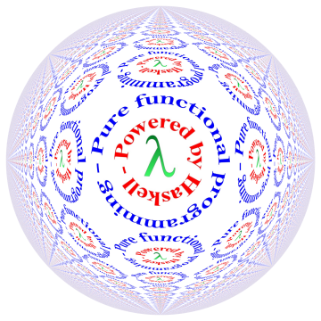
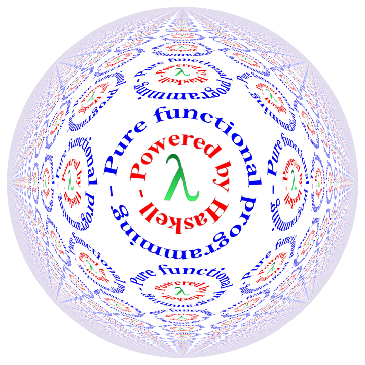
http://conal.net/Pan/Gallery/haskell-powered%20on%20white%20tiled%20360.png
One I made with Pan (purely functional image synthesis in Haskell) some years back. See also the 720 square version. I have a few sizes up to 2250 pixels square.
Conal 03:40, 17 December 2008 (UTC)

Just kidding :P
--Trontonic 05:04, 17 December 2008 (UTC)
Cale Gibbard
![]()
I originally had no specific mountain in mind, but Don Stewart pointed out that this might be representative of Mt. Hood in Portland, Oregon, where Haskell was named.
Regardless, I thought a summit, bathed in the pure mountain air would be a decent symbol for Haskell, the peak of contemporary programming. :)
CaleGibbard 05:55, 17 December 2008 (UTC)
- Here's a modified version with a slightly funkier font :) I think that it matches the lines of the image better... Porges 03:14, 18 December 2008 (UTC)

Probably not a good choice for a logo:


Simplicity.
(It is possible that the font may need to be replaced with a free alternative.)
JonathanJ 16:34, 17 December 2008 (UTC)

Available as SVG.
MaxRabkin 05:37, 18 December 2008 (UTC)

Another variation for the cognicenti:

--Warren 07:26, 18 December 2008 (UTC)
A slight variation of the ">\=" logo:
![]()
Not that it's worth much:). Available as SVG.
DoubleF 07:36, 18 December 2008 (UTC)

The idea for this wordmark is to modify A to resemble λ and through this tie together the "Haskell" to the "Lambda". Modified A also works well as a standalone logo:

Note that any logo based on the unmodified λ symbol may look ambiguous to the people outside of Haskell community. While the λ in the context of programming languages is clearly associated with functional programming, it is a lowercase Greek L and so it's reasonable for an outsider to associate it with Lisp, and not Haskell.
PS. I just scrolled up and saw BONUS'es entry (14:40, 16 December 2008). While its idea is close, I think using pure λ in place of an A doesn't work because it effectively turn the name into H-L-skell.
Apankrat 07:38, 18 December 2008 (UTC)
A very simple logo, made with inkscape, using math fonts, with various grades (B&W, grays, fill color & gradient) and backgrounds

SVG available here: File:Simple haskell.svgz
Aubanel 18:08, 18 December 2008 (UTC)

Available as Inkscape SVG

Available as Inkscape SVG
runrun 18 December 2008
![]()
Contact me for SVG. Font is not currently free, but I designed it, so this can change if it becomes "the Haskell font". I think it shows some of the elegance that Haskell has. If you like the font but can put it with a better logo, go ahead. --MaxRabkin 04:53, 19 December 2008 (UTC)

I think the best way to represent the pure, functional nature of Haskell is with a pure and functional logo! Something modernist, minimalist, clean and simple. I'd prefer not to put highlights of the language's syntax in the logo - that's remarkably concrete for a language good at abstraction. Even lambdas etc. should be slightly hidden - those who know what it's about can see them, and everyone else doesn't think 'what's that funny symbol?'. For the font, again, something functional like a light Helvetica or Univers.
So, I thought I'd have a go at a few variations. I'm not convinced it's worked, but there you go. I've shamelessly ripped off tanimoto's idea. Sgf 08:13, 19 December 2008 (UTC)
- Sgf, I really like your logos and I think you captured my idea much better than I could do. I especially like the red one, a bit Escher-esque. I wonder if we could turn the blue one into something that looks more like a snowflake than it currently does. Thanks. tanimoto 10:43, 19 December 2008 (UTC)
- I also like the blue and the red logo. The resemblance of a snowflake fits the purity of the language. Perhaps you could give the lambda's more volume to make it more plate-like? Felix
- Thanks for the comments. I'm going to be offline for about a week, so I'm not going to have a chance to knock up further variations soon, much as I would like to. So, if you have the time, feel free to generate variations from the Inkscape SVG. Otherwise, I'll have a go when I get back. Cheers, Sgf 01:48, 20 December 2008 (UTC)
---
λλλ
Haskell The Revenge of the Nerds
---
http://www.haskells.com/images/logo.gif
---

Someone on the mailing list suggested something based on Orouboros. Here is the Ouroborous-oval.svg Inkscape SVG.